Inspired by place. Grounded in people. Expressed through design.
Stomata
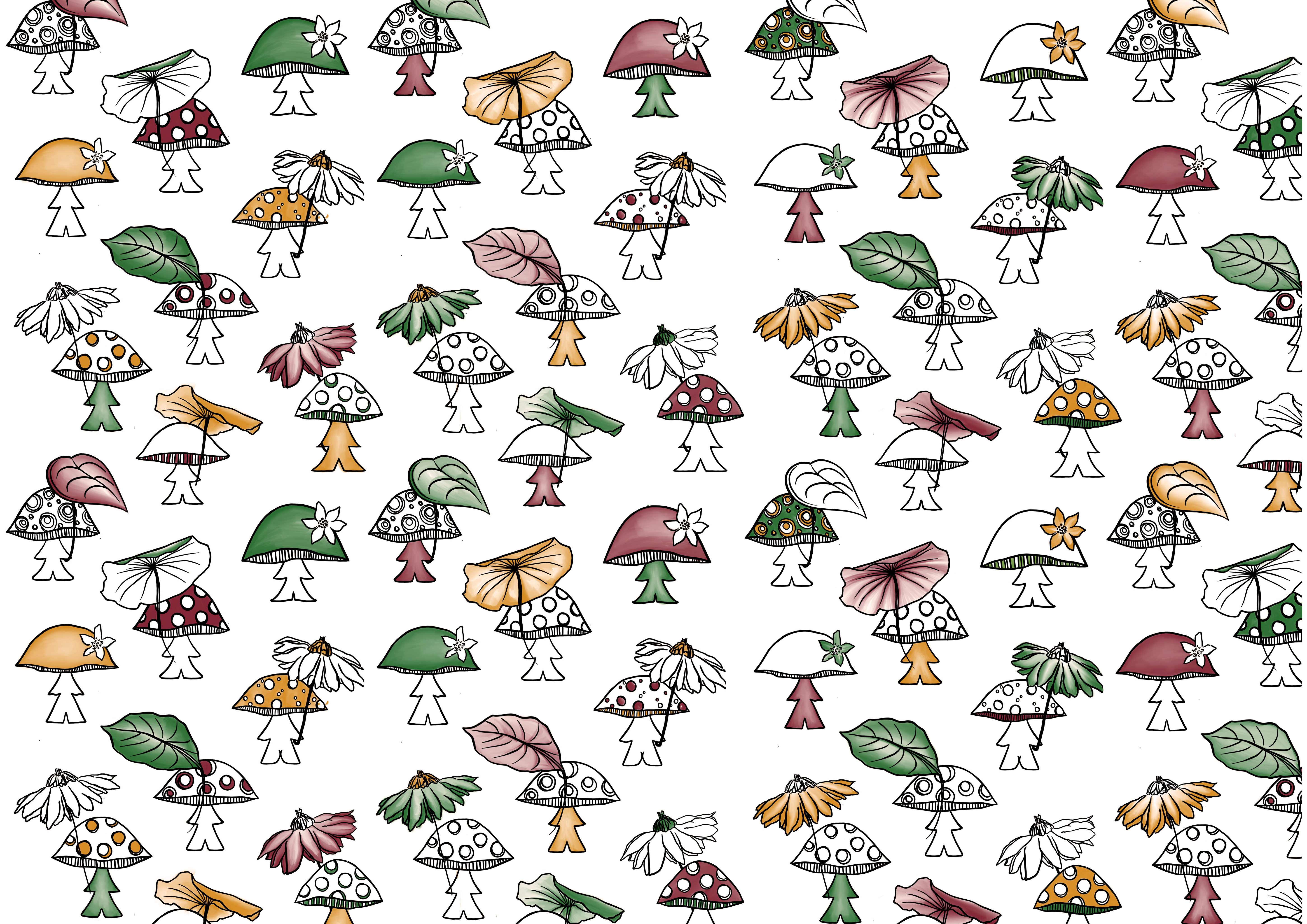
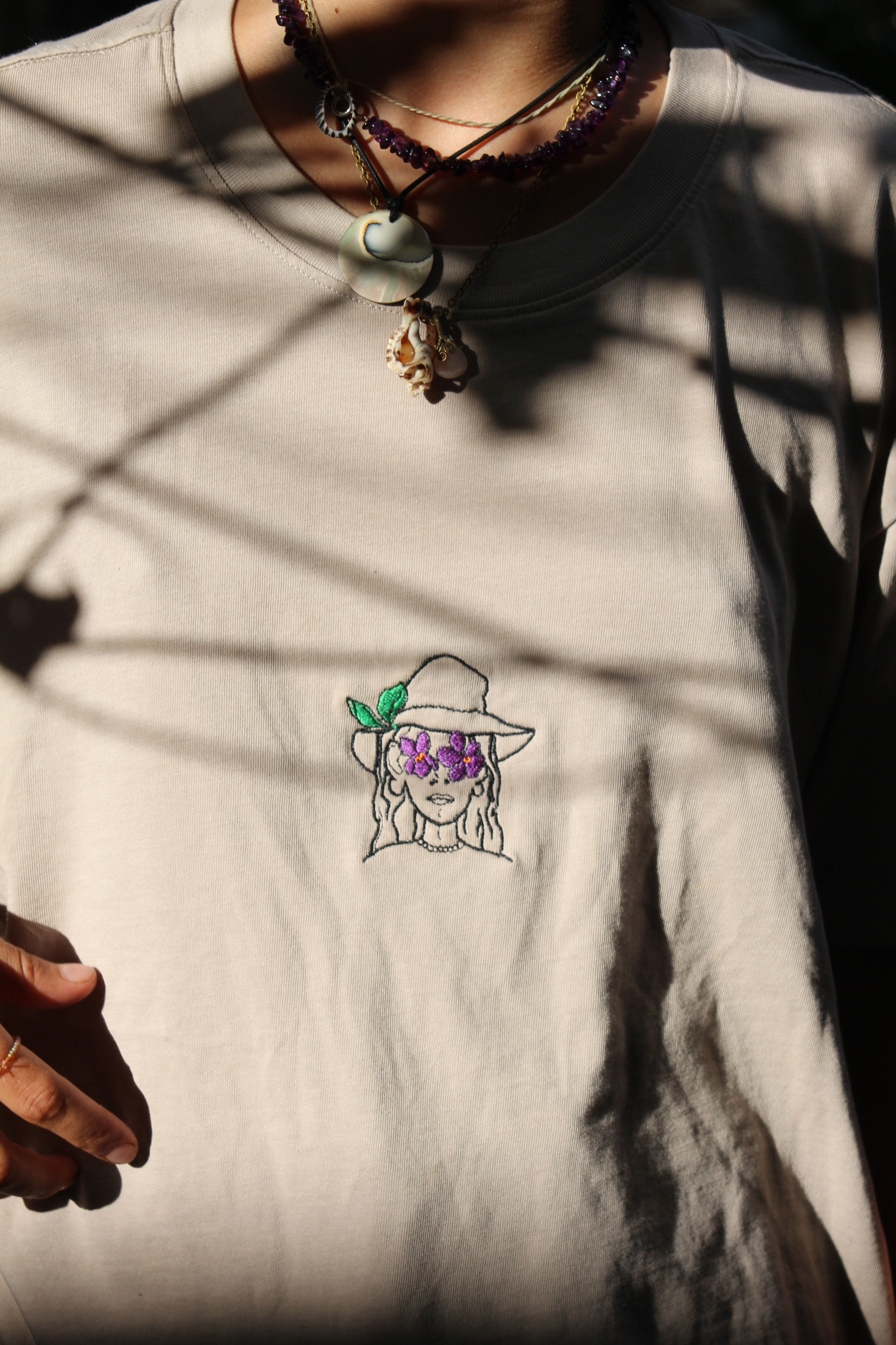
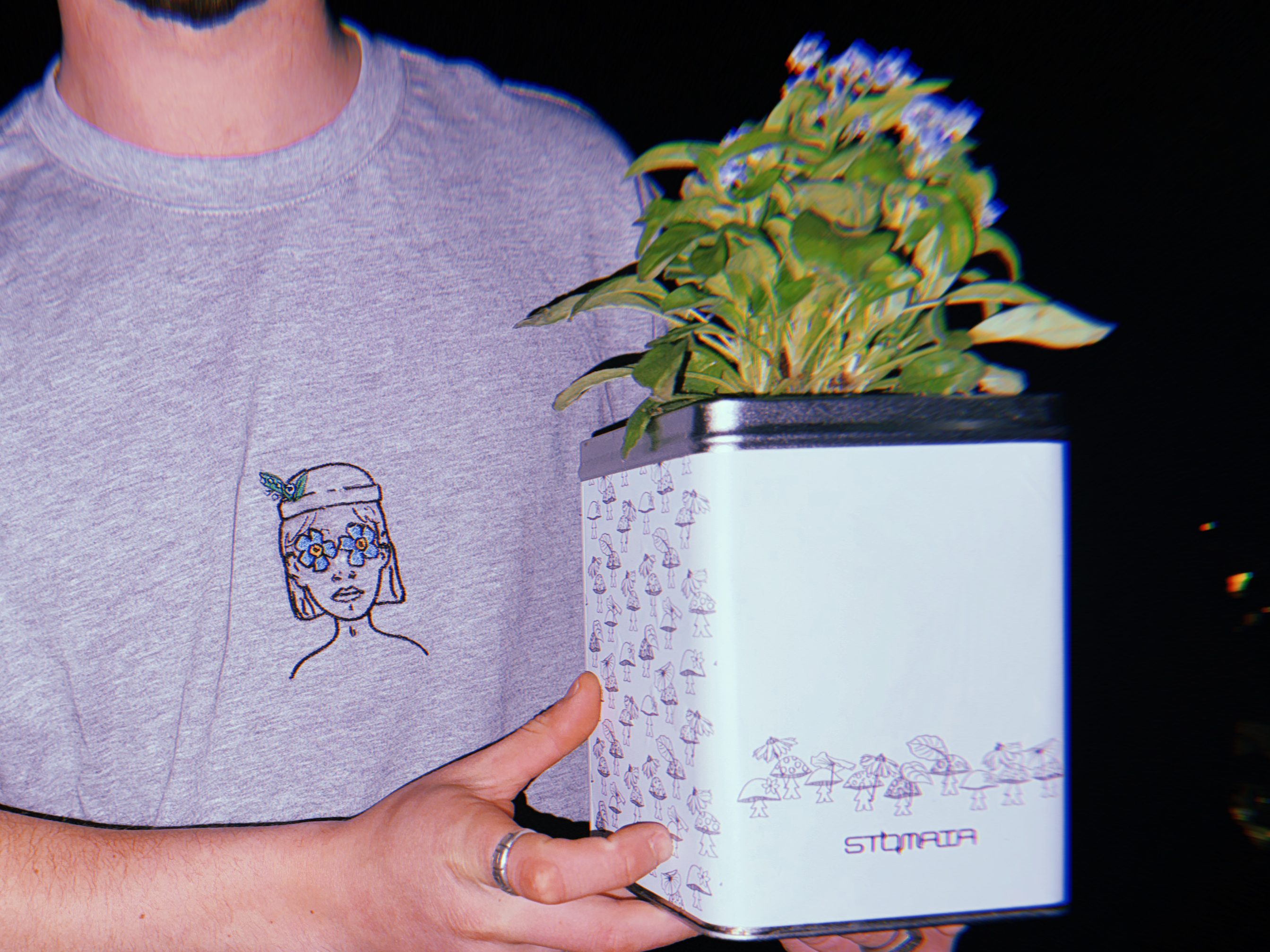
I worked with Stomata as their freelance designer from 2023-25. My main roles included product and packaging design, creating visuals that aligned with the brand’s identity and communicated its values. Where stomata was a start up company, I was given more freedom to come up with designs as there was no previous aesthetic to coincide with, although this did mean that the communication of the brands values was even more important. It was important to convey an alternative, hippy aesthetic whilst keeping the designs on the clothing minimal, ensuring it would be suitable to be embroidered.
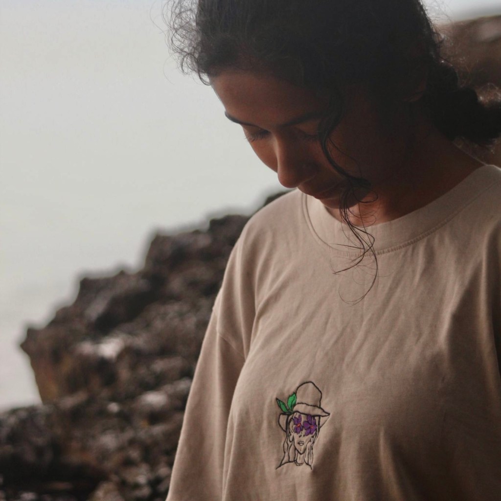
Travel
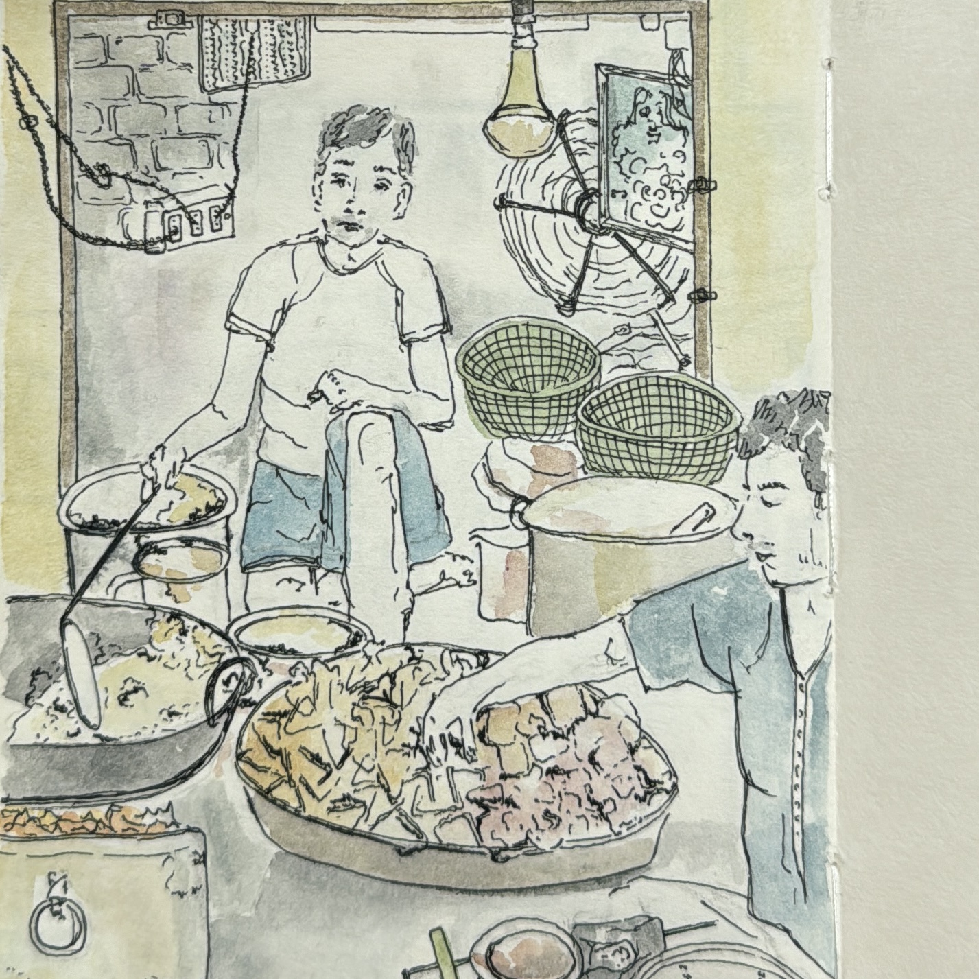
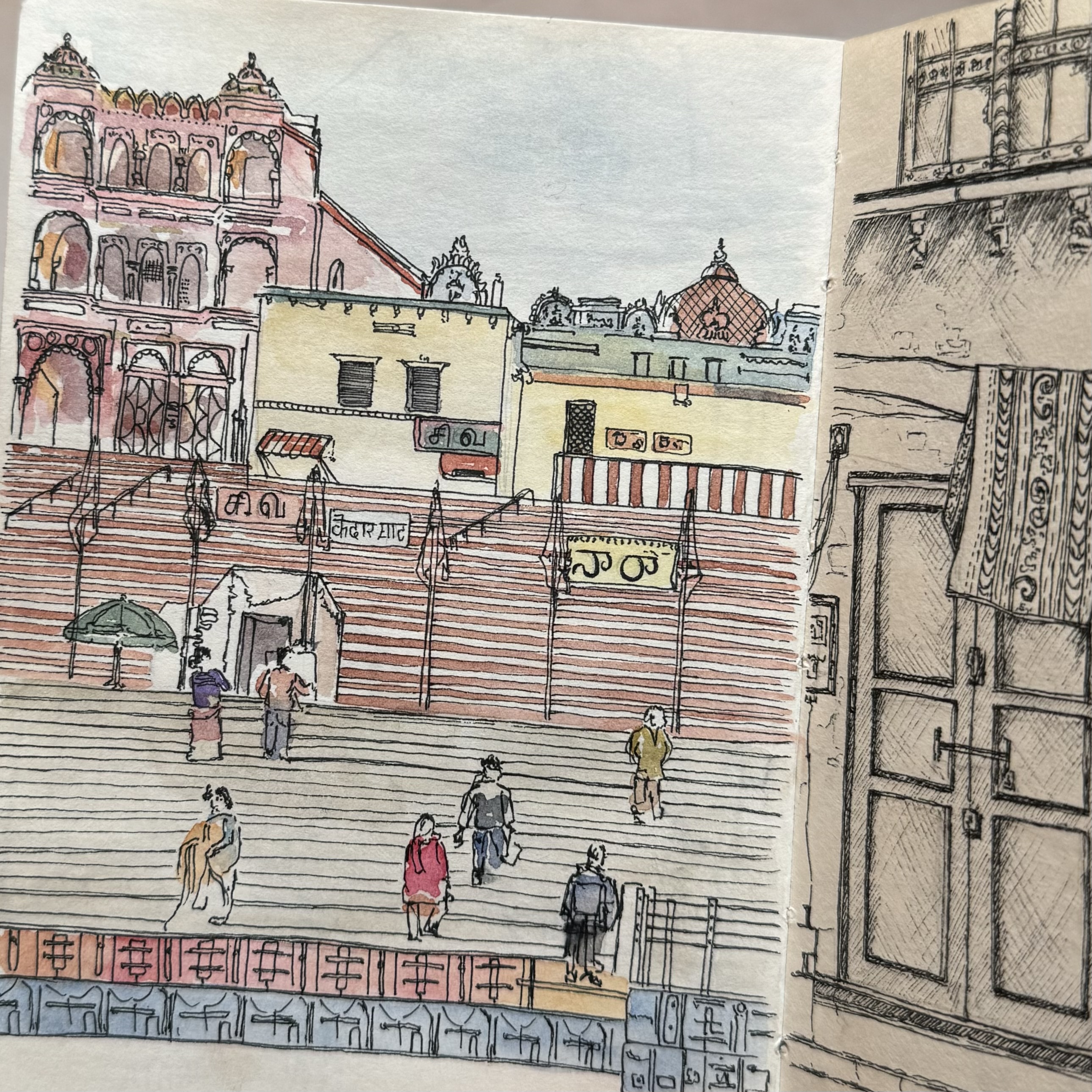
After graduating I spent a year travelling around Asia which was the most influential of my life thus far. Understanding new cultures and learning about alternative ways of life I felt more inspired than ever.
Space in my backpack was limited and I was only able to carry a sketchbook and 12 pan water colour set with me. I used my sketchbook to capture memories and places and quickly became, my most valuable possession, it got to a point that I would’ve rather lost my passport than my sketchbook.


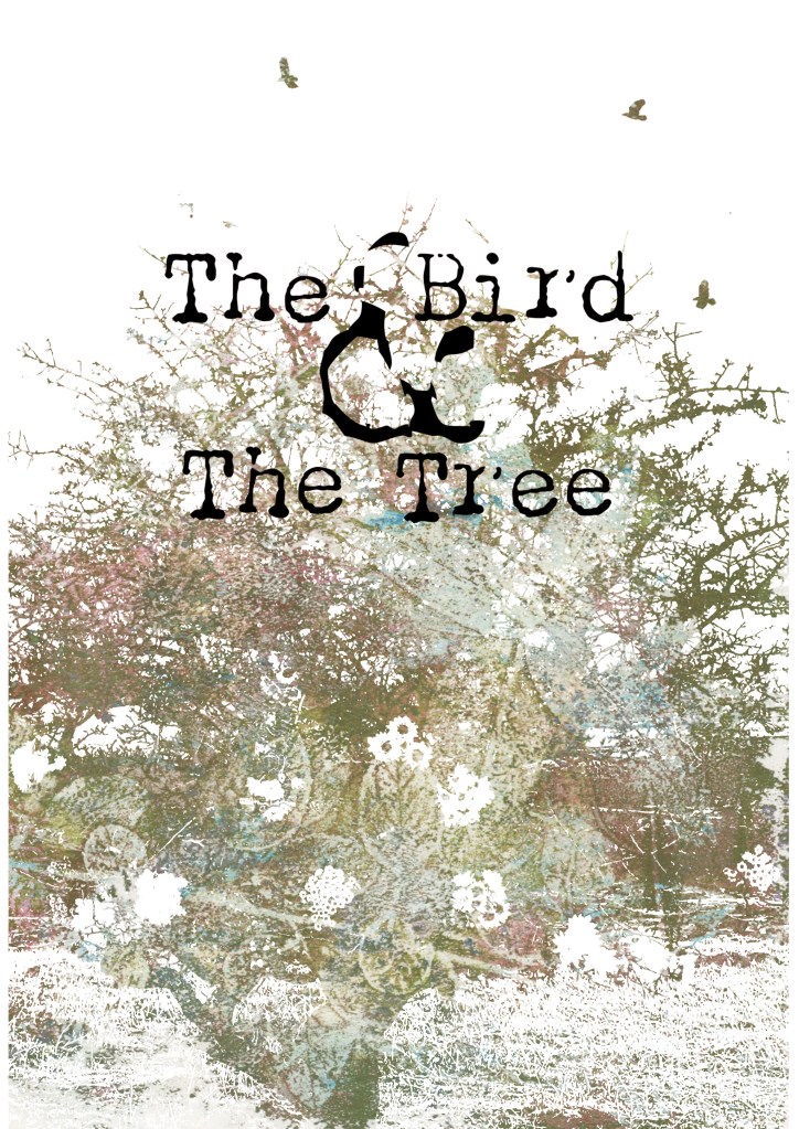
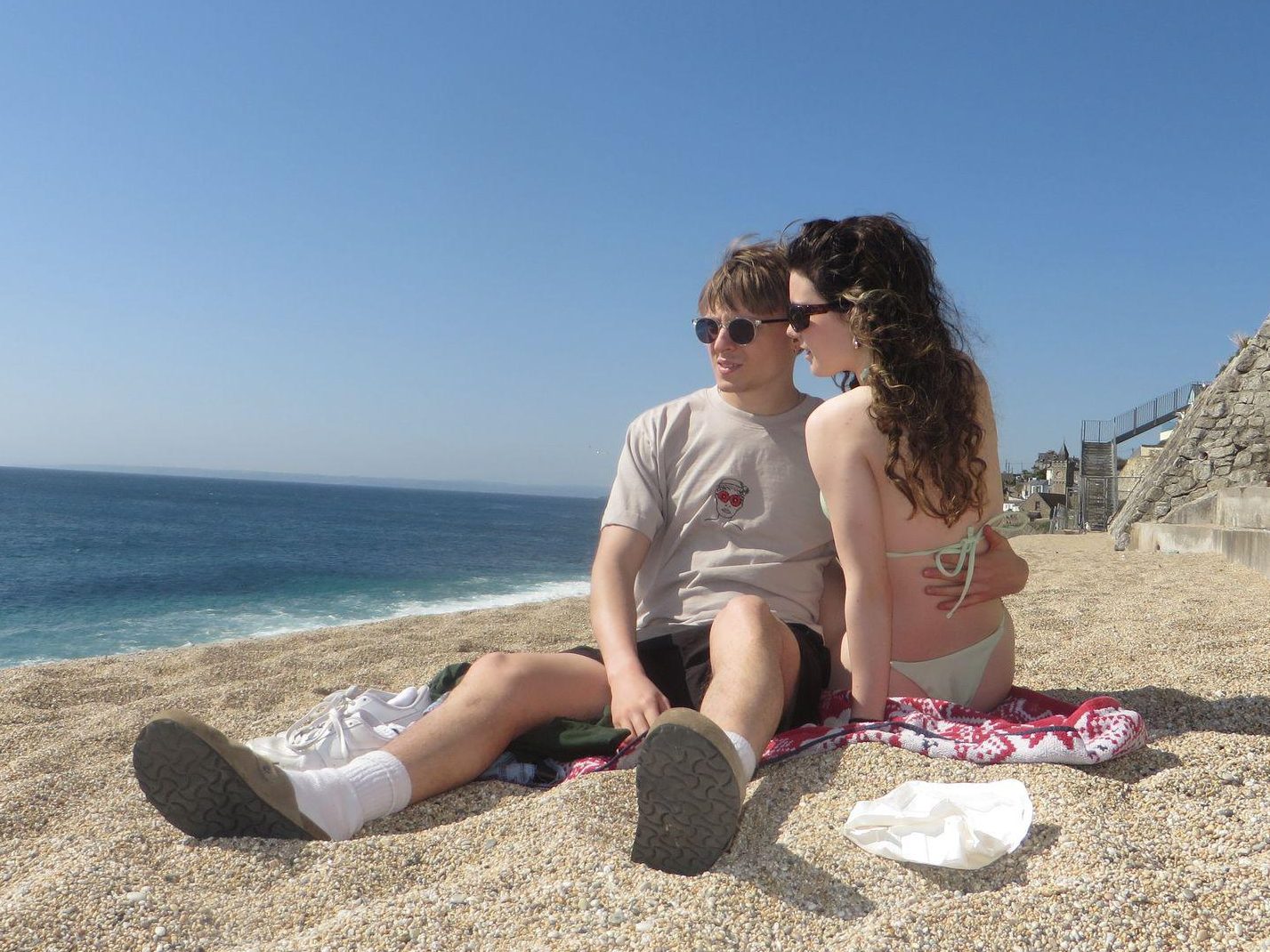
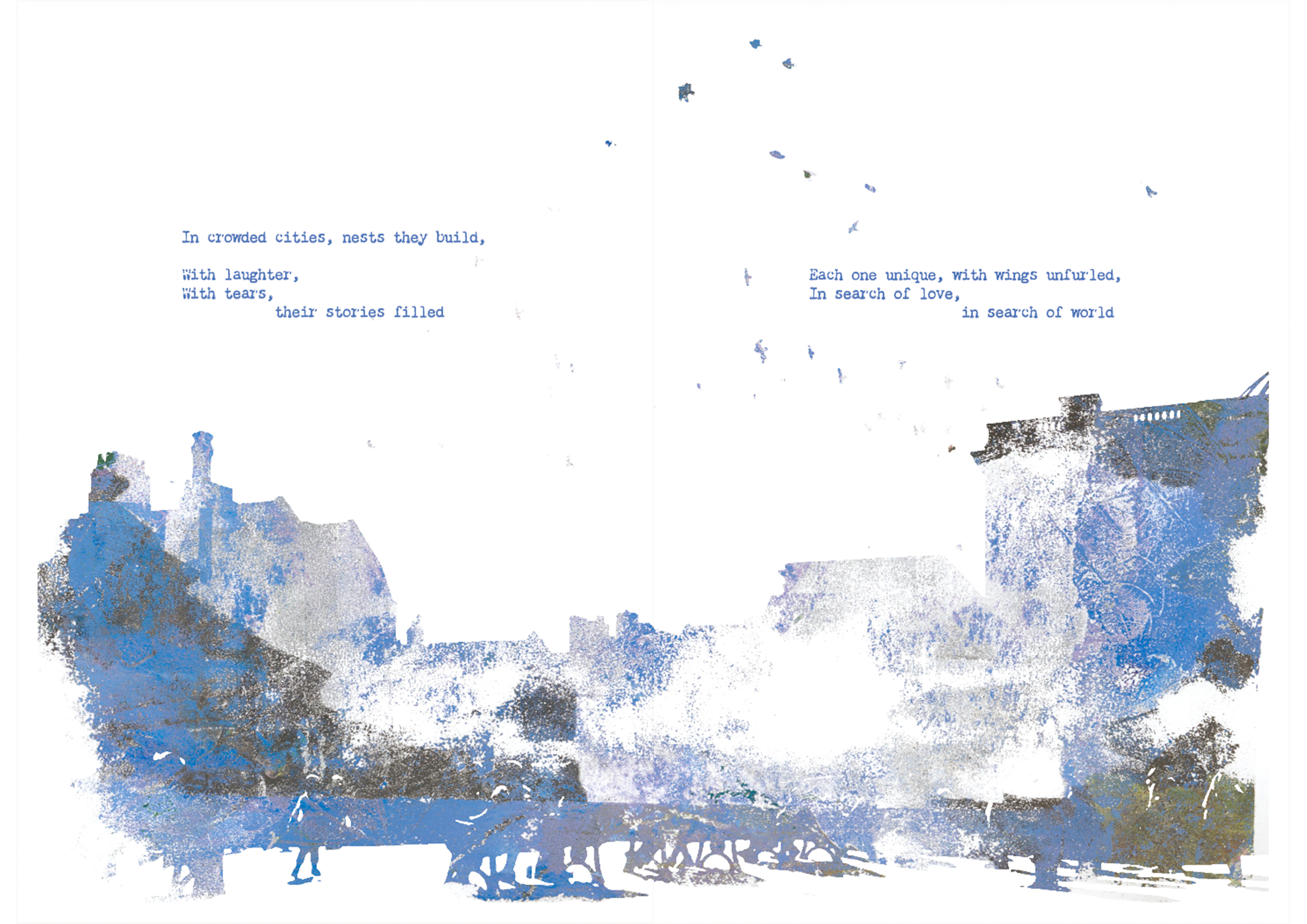
The Bird and The Tree
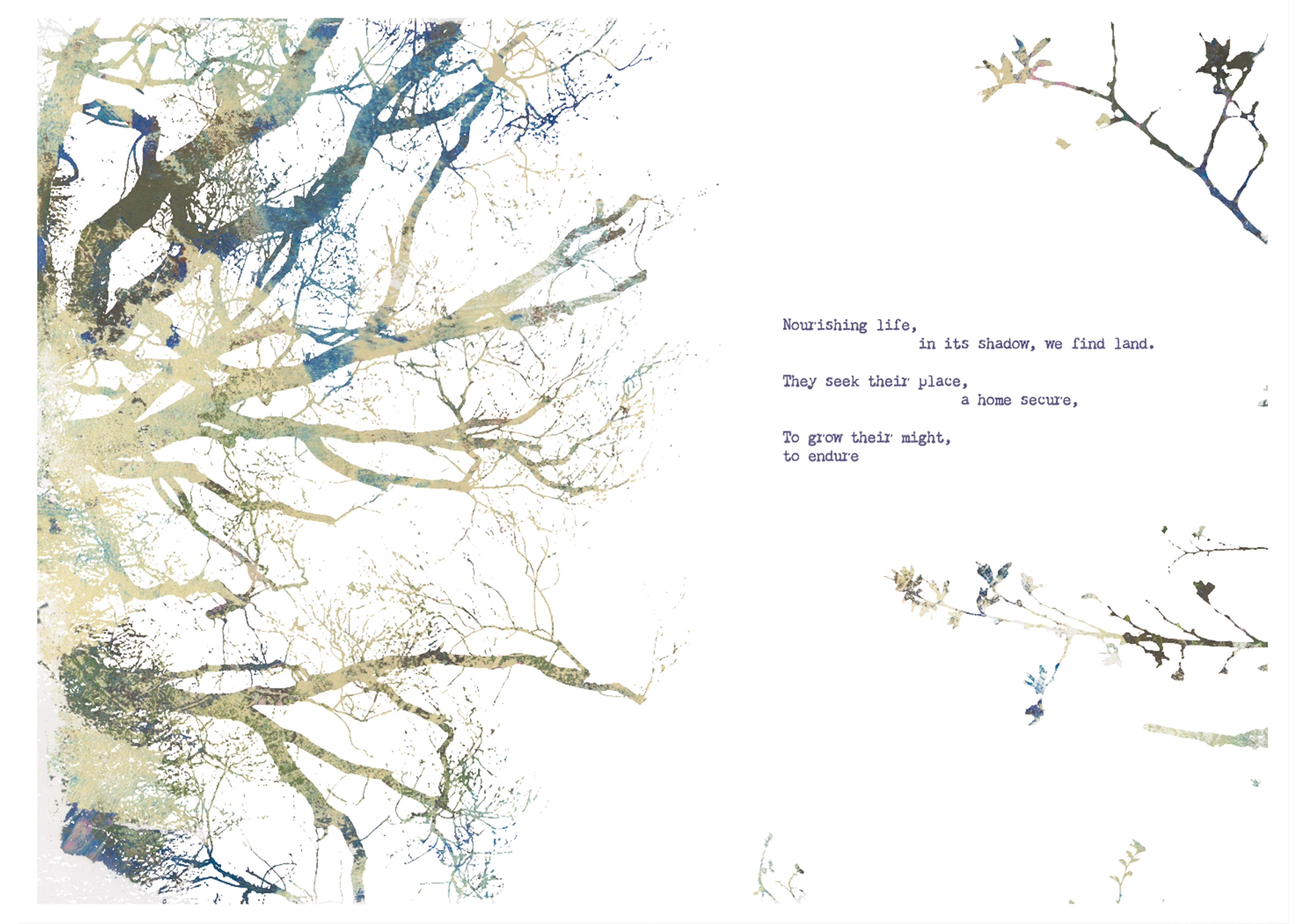
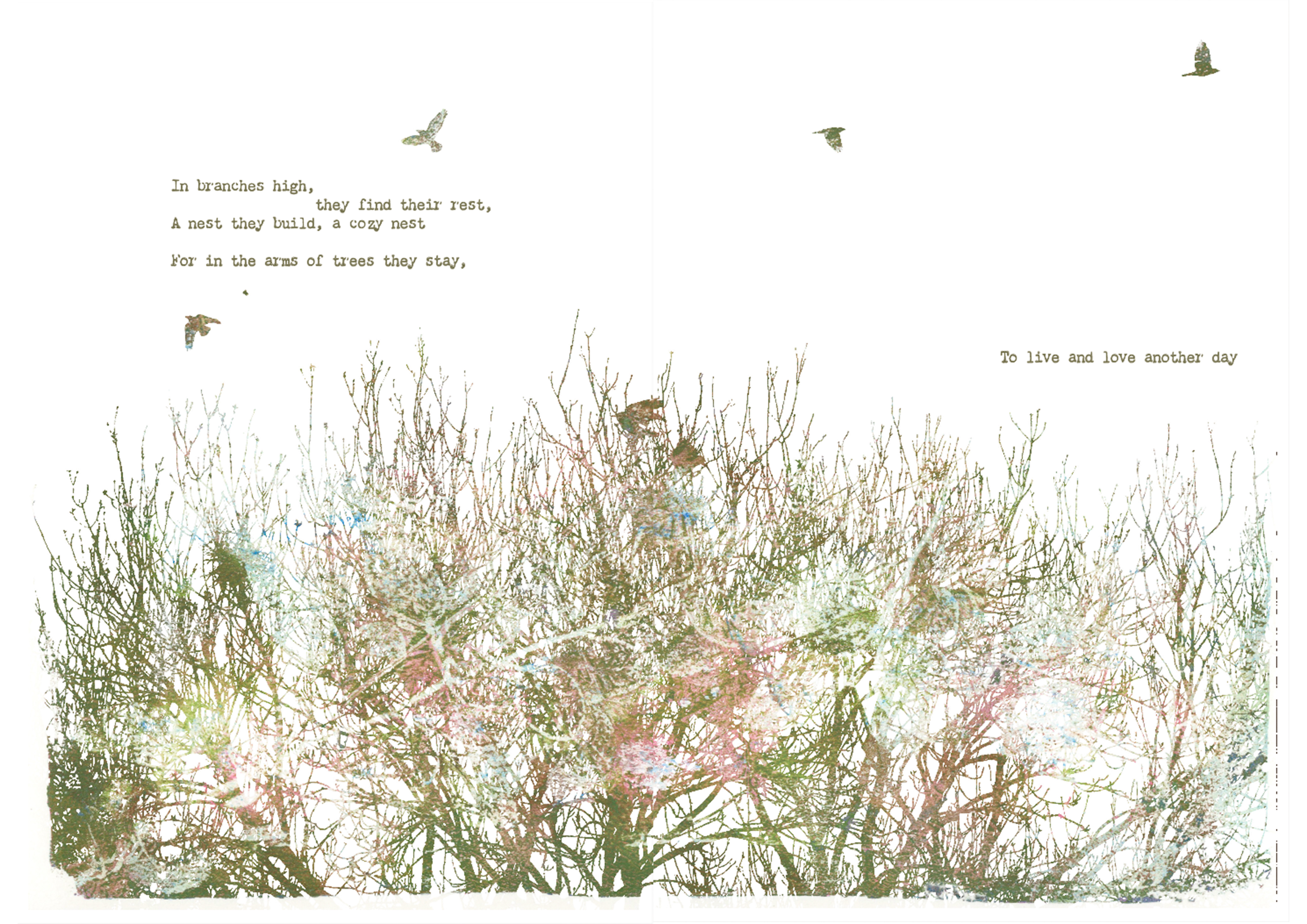
From a conversation on the bus with a stranger about the concept of people fitting into the roles of holding traits of birds or trees, in the simplest analysis being grounded and providing like a tree or free and inquisitive that relates to birds.
This interaction soon became constant on my mind and I began looking at friends deciding whether their personality best fits a bird and a tree. I found being able to create a connection through nature had a simple charm to it and decided to use it for one of my final projects at uni.
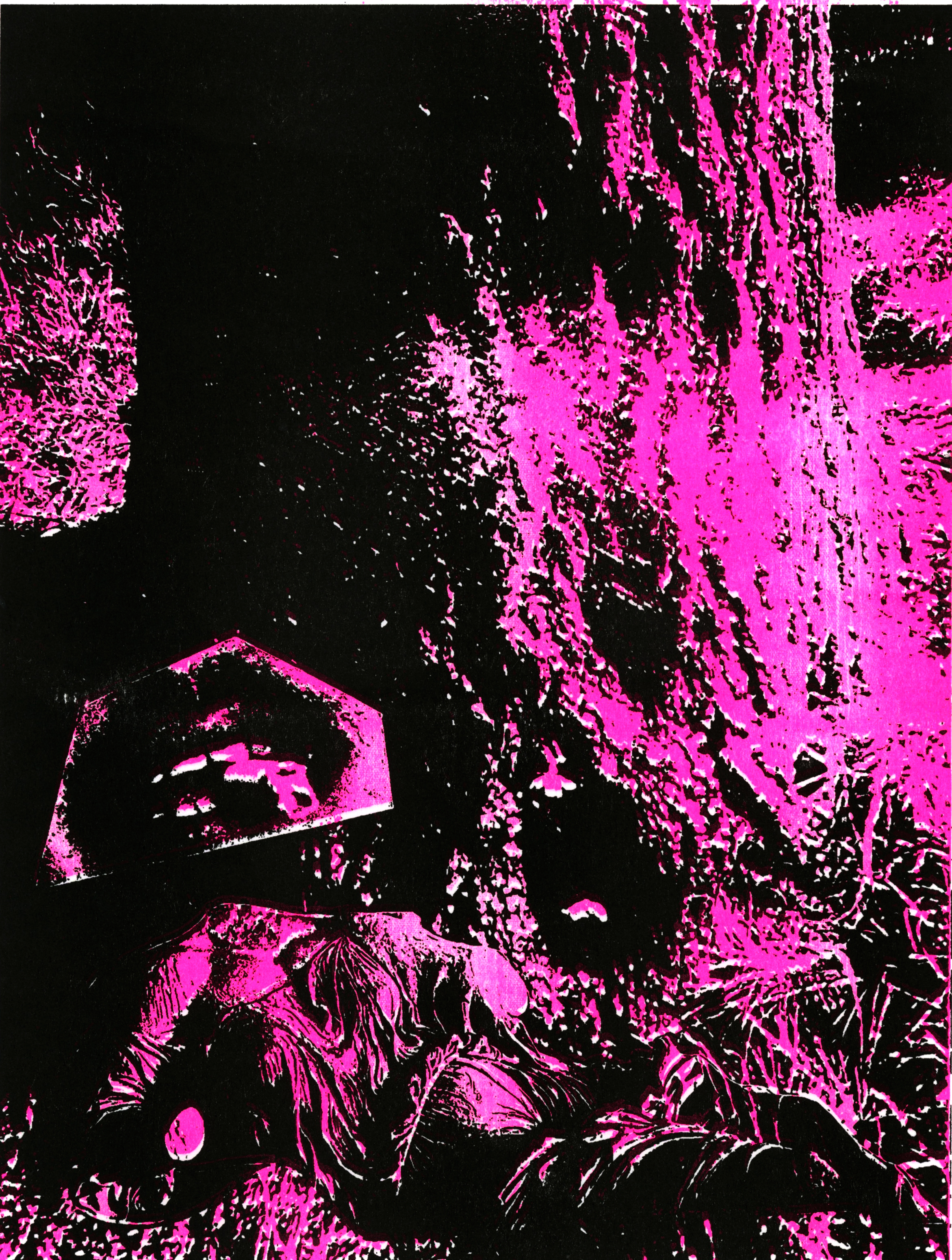
After writing a poem, I had the body for the zine and created the images by making prints out of leaves and a gel plate and overlaying photography which resulted in these textured stacked images which gave the gentle aesthetic I hoped for the project.

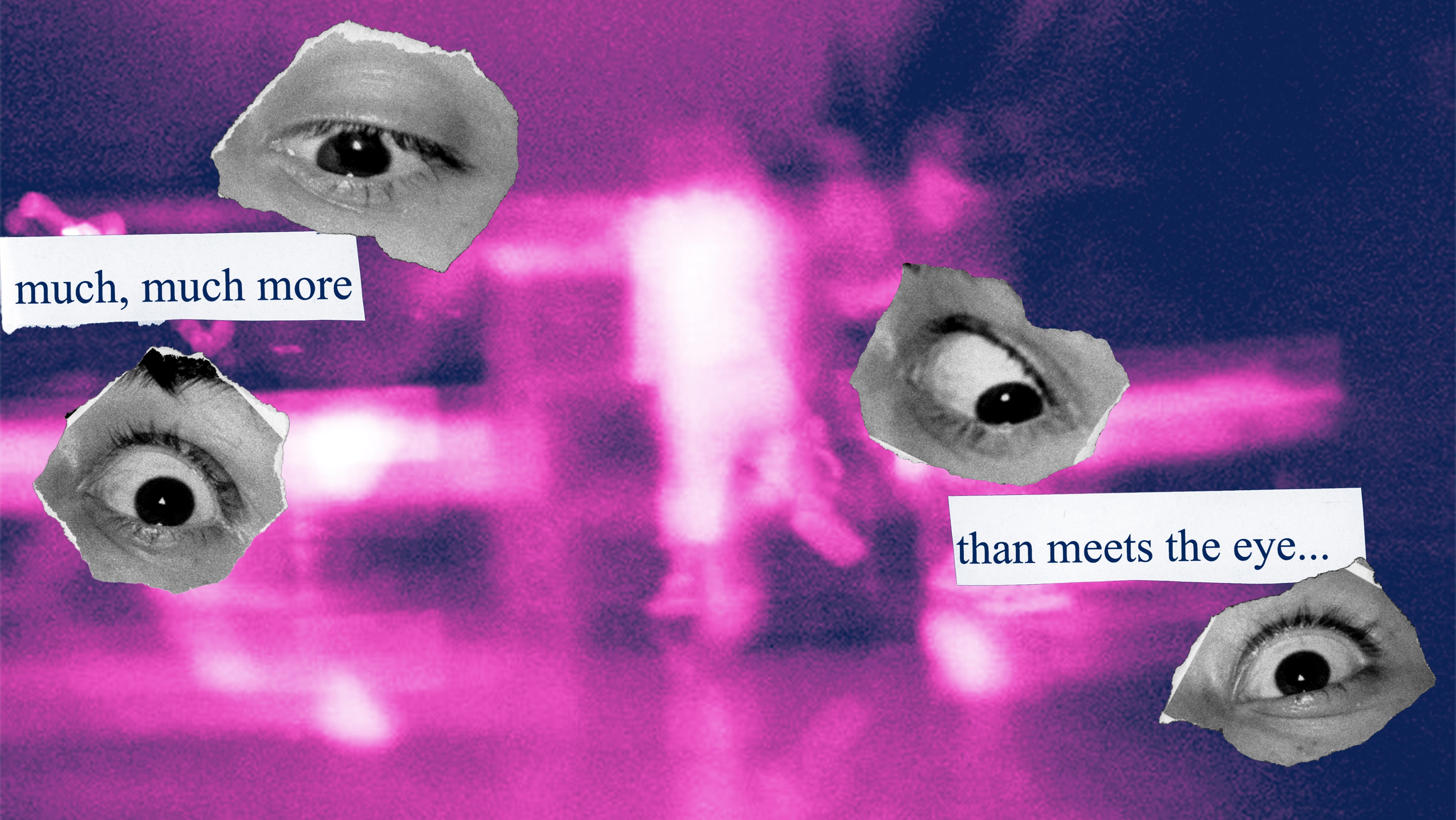
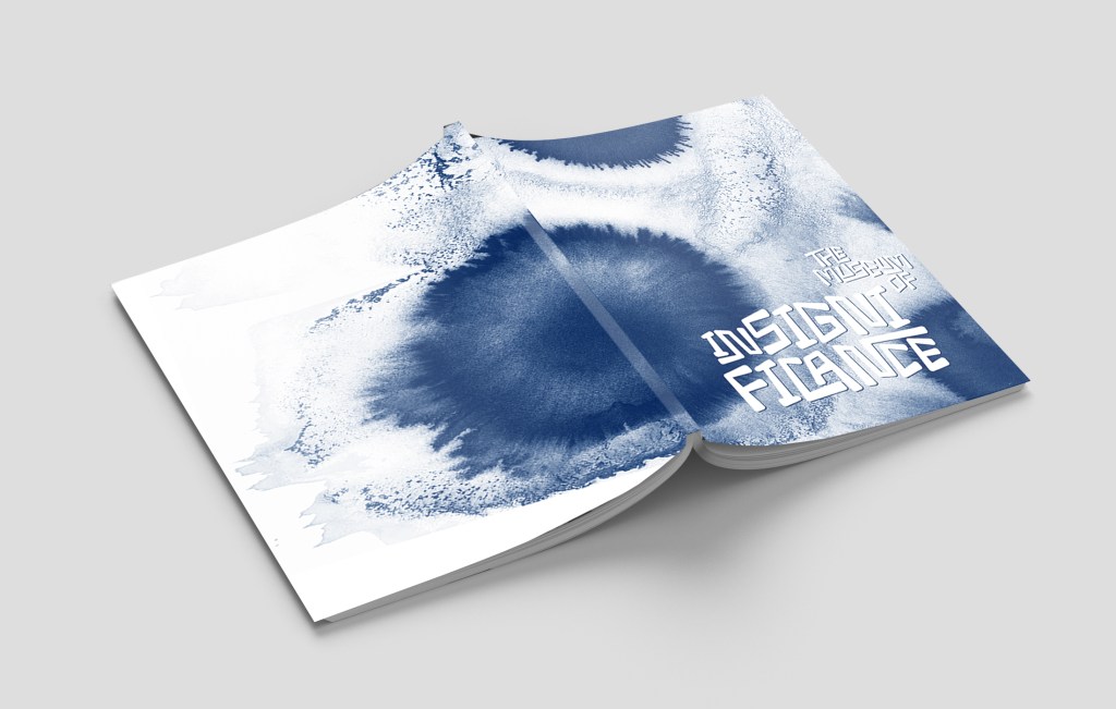
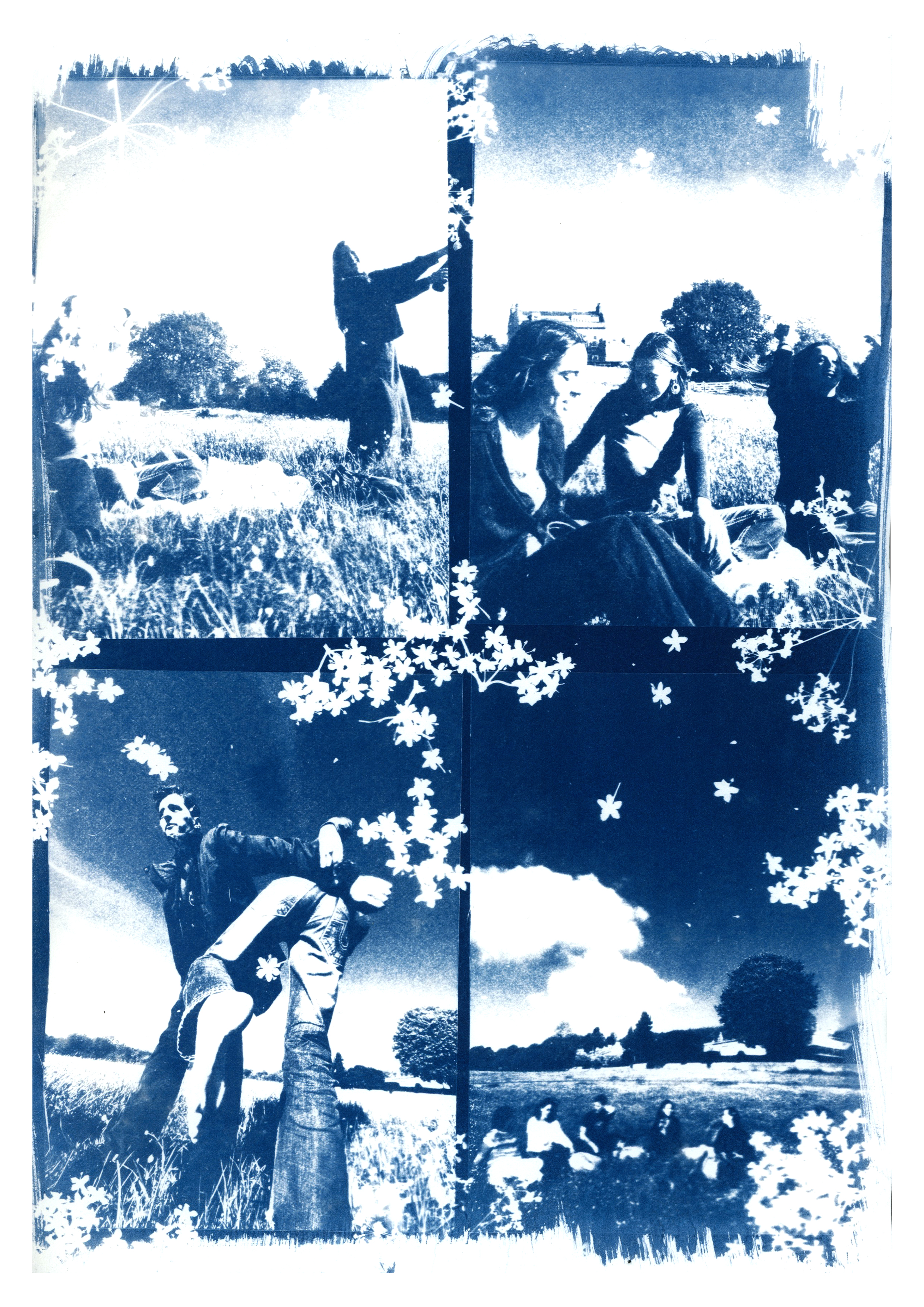
The Museum of Insignificance
This project is about identifying the moments that may hold no significant value in the grand scheme of things but can be seen as an intimate reminder that the small memories are none the less important.
This project was produced in my final year at university, I wanted to make the most of the workshops offered on the University campus and decided to mainly use analogue techniques as a result.
The cyanotypes unintentionally set the base aesthetic for the zine, the contrasting blue struck me as soon as the first round of prints was complete, I knew this would be the constant throughout.
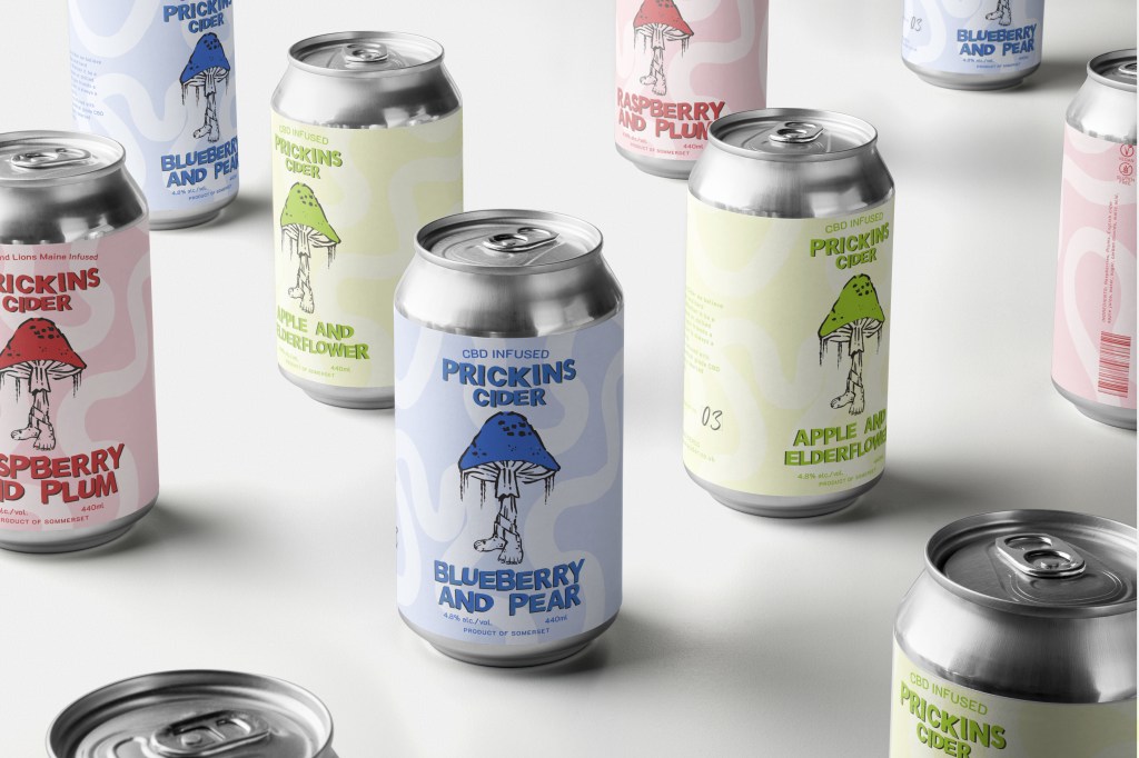
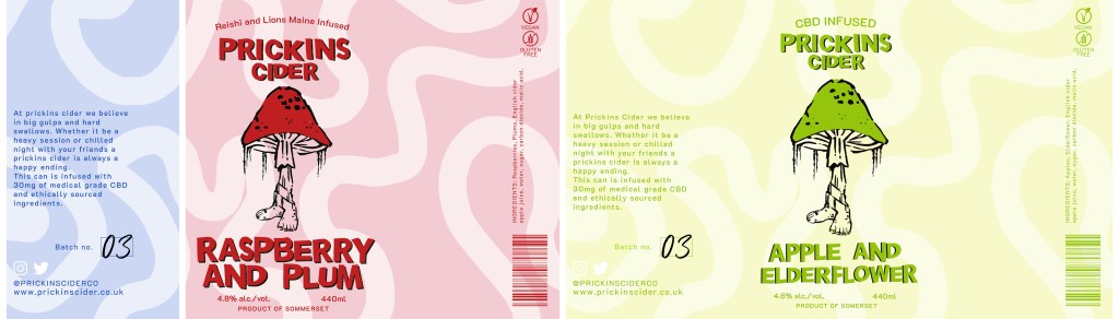
Prickins Cider
This project was an entry into the Hatch competition 2023, run by the branding agency BrandOpus. Prickins Cider breaks away from traditional ciders, aiming to enter into the craft cider industry apposed to the traditional cider industry. It takes inspiration from the current health and wellness culture by incorporating CBD and medical mushrooms into the cider, making cider more appealing to those that don’t typically reach for cider.
Graphic Designer
Tash Elliott
tashelliott080@gmail.com